TinyTales

TinyTales

TinyTales

Curating books with valuable life lessons for children

Time Frame:

One week
design sprint - 2021

My Role:

Solo UX/UI Designer

Featured Skills:

Concept UX Design

Visual UI Design

Overview

The Client

TinyTales is a new startup with a library of children’s stories that parents can read to their children. These stories are discovered and read within the TinyTales app on an iPad or Tablet.

Design Challenge

It is difficult and time consuming for parents to find stories to read to their children. These stories need to be age appropriate and interesting.

Design Sprint Goal

To make it easier for parents to find a great story to read to their children!

Design Solution and Outcomes

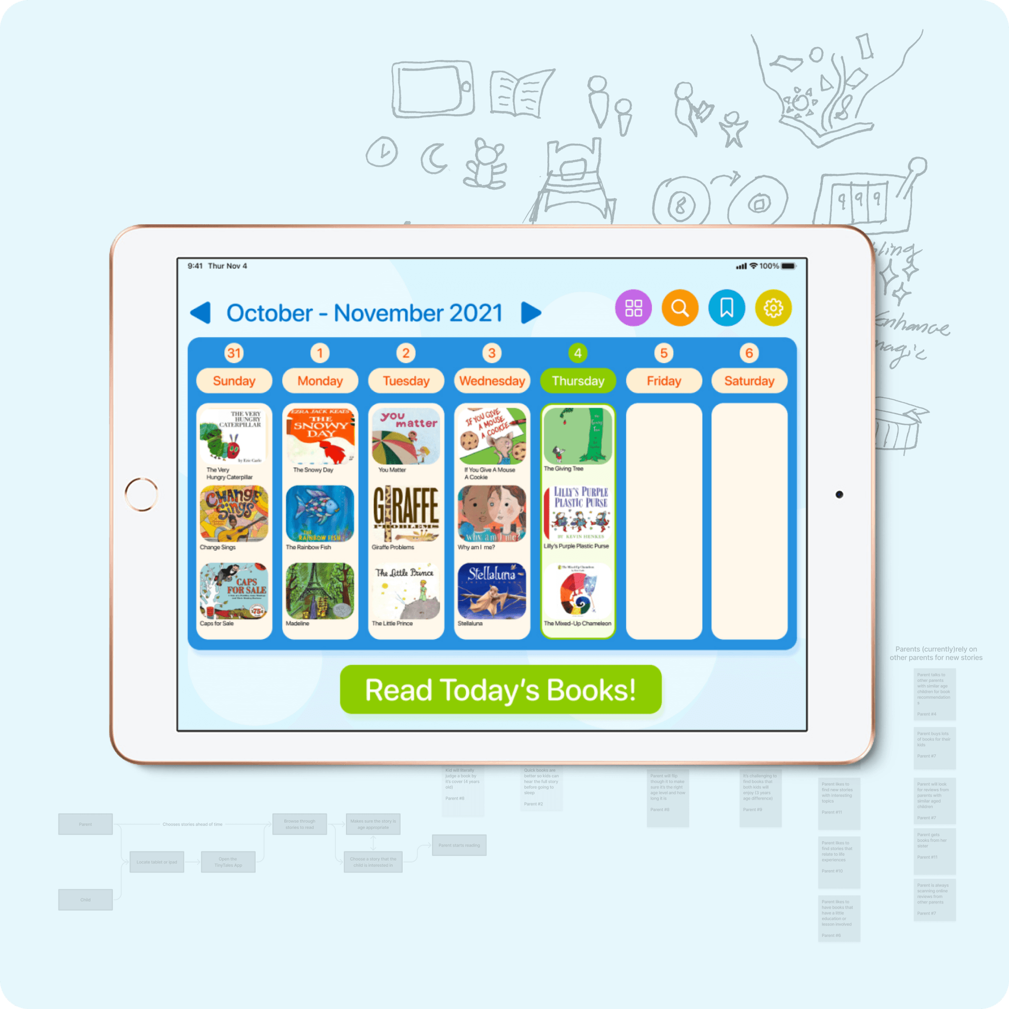
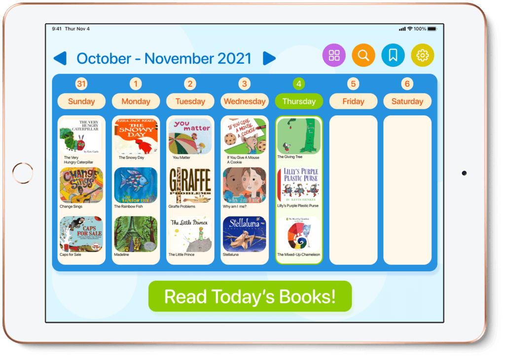
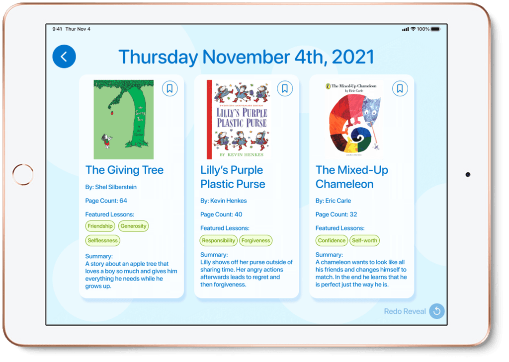
An advent calendar app that curates three new books each day for parents and children to enjoy together. Each book highlights specific learning lessons that children can relate to their daily lives. Initial usability testers’ feedback was positive about this approach with inspiration and ideas for further development.

The Sprint Timeline

To quickly explore possible design solutions for this client I used a modified version of the Google Ventures design sprint process developed by Jake Knapp, John Zerkatsky and Braden Kowitz. This process uses 5 days for a team to understand a problem, define a design goal, develop a possible solution and then test it out. A few of the sprint steps were omitted so I could do this sprint as a solo project.

Day 1

Research synthesis
Affinity map
Target persona
Defining the sprint goal
Primary user flow

Day 2

Competitor Analysis
Concept sketches

Day 3

Asset collection
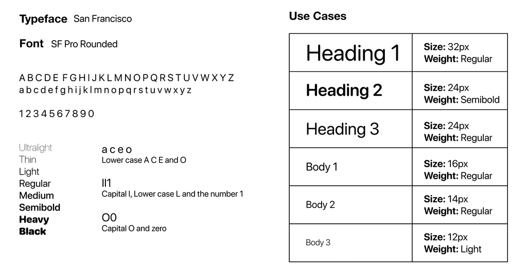
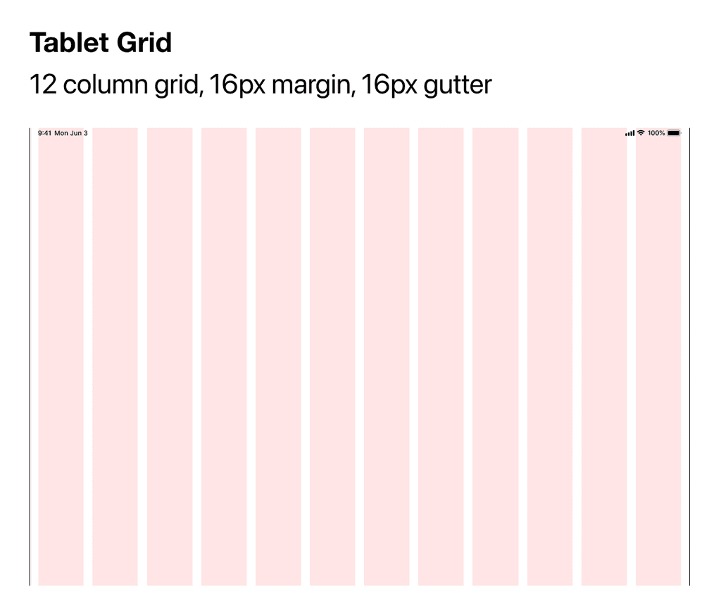
Style guide
Storyboard

Day 4

Prototype
Animations

Day 5

Usability tests
Reflection

Day 1 - The Context

Organizing the Research

Interview highlights were gathered prior to this design sprint from 12 parents with children ages ranging from 3-7 years old. I started by reviewing all the interview quotes, notes and recordings given to me to start understanding the problem space.

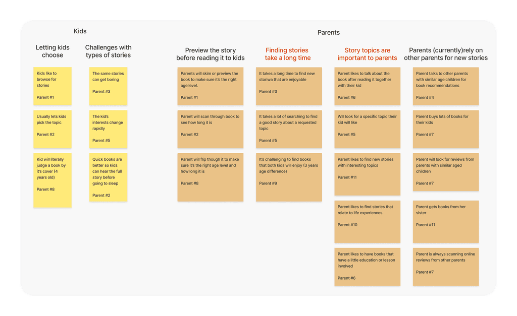
I organized my notes and any significant quotes into an affinity map to help see which pain points were the most significant for parents and children.
Interview prompt: “Tell us about how you choose a book or story to read to your children”
Affinity Map using Figjam

“ I obviously want to read something that my daughter will enjoy, but I also try to make sure there’s a little education or lesson involved that we can talk about.”
-Ron, parent of a 5 year old

Stories With a Lesson

I learned that parents struggle with finding good stories because they want to use stories as a teaching moment. Story topics need to be both interesting, educational, and age appropriate.

Top Criteria For a Good Story

  1. Topic
  2. Duration
  3. Age appropriate (subject and grammar wise)
  4. Illustration appeal
  5. Newness

Knowing Who to Design For

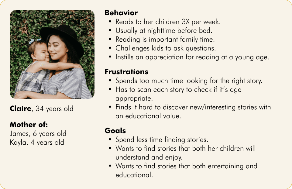
A primary persona was provided with the research I received. This profile was made from all the prior research and it helped me know who I should be designing for.

This Design Sprint’s Impact

After understanding the problem and primary audience I spent some time defining why I’m doing this design exercise.

Sprint Goal:

Make it easier for parents to find a great story to read to their children!
With this sprint goal in mind I asked myself “why” 5 times to understand the greater impact that this TinyTales app would have on families with children.

Making a Map

I made a rough user flow so I could understand what a parent and child need to do when it’s time to read a story. I realized that depending on each family this flow could be different. What time of day do parents read to their children? Depending on the age of the children do parents or children choose the books? Regardless, mapping out what happens helped me see the full journey that is taken before even starting to read a story.
Day 1 was all about the set up. I took the time to really understand the problem and I felt confident after learning who I would be designing for and the challenges they currently face.

Day 2 - Concept Development & Ideation

Competitor Observations

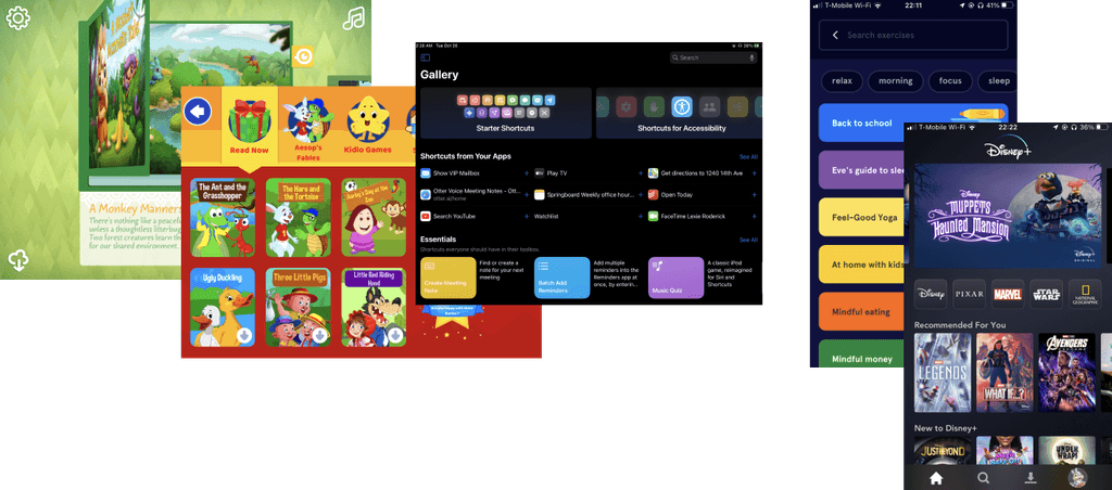
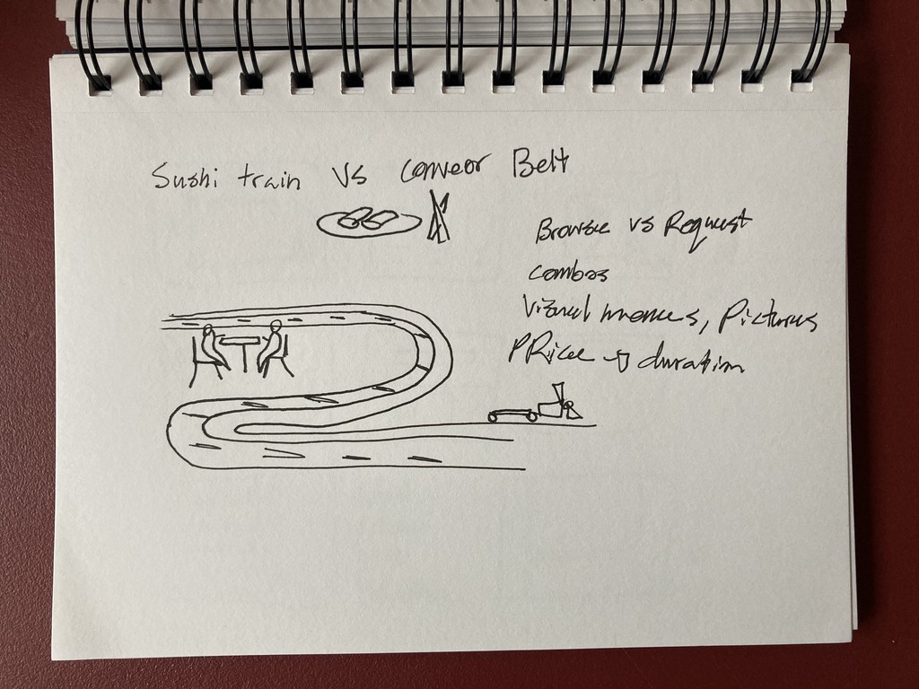
Now that I knew what I wanted to improve and who I would be designing for I started looking at competitors that have tried to provide a similar experience. I didn’t limit myself to just other reading applications, but any iPad or Tablet experience that had people browse and select something.
Screenshots of Competitor Apps for Inspiration

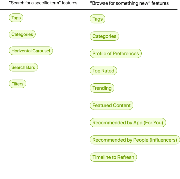
Common User Flows

I found that there are two ways that people discover content that interests them:
1. Search for a specific term/item
2. Browse for something new

Brainstorming a Solution

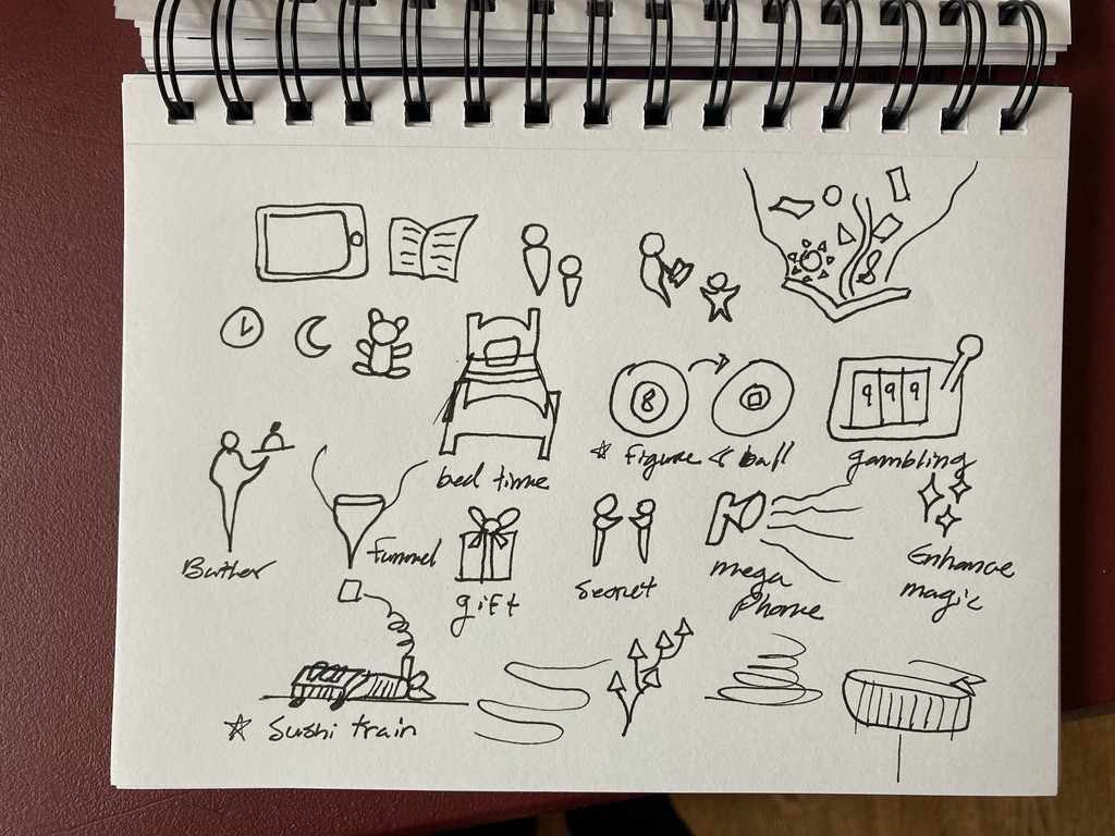
After observing all the competitors I started thinking about possible solutions to help parents who use TinyTales. Once again asking myself what I can do to help parents find great children’s stories quickly.
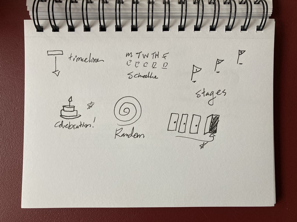
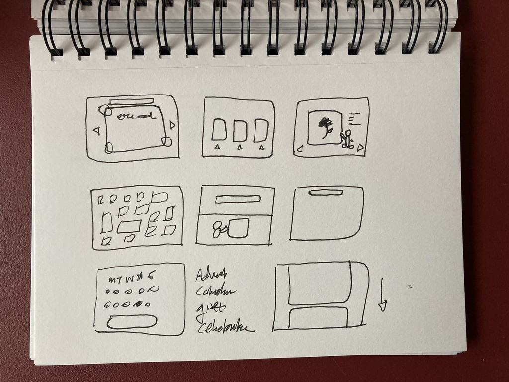
Hand Sketches

Chosen Design Concept

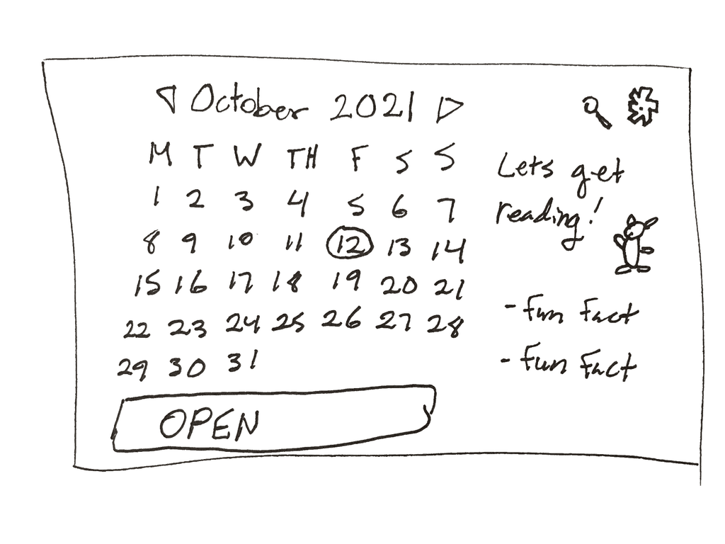
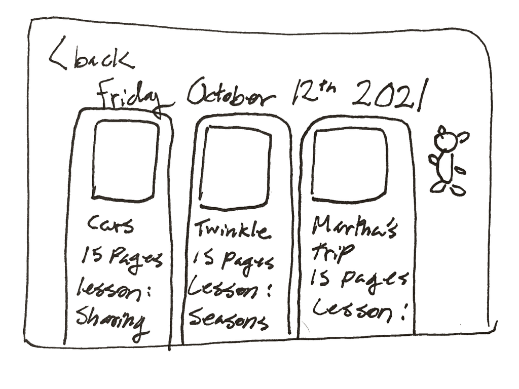
Writing and sketching my ideas helped me explore different possibilities. At the end of the day I settled on an advent calendar approach. Parents use stories to teach their children about life and I wanted to tie in the books that they read with time. Instead of making parents browse through categories and filter stuff out I thought each day could offer the family three books to read. The unveiling of the books could be exciting for kids and presenting only three books can eliminate decision paralysis for the parents.
I ended Day 2 feeling very inspired. I learned a lot from seeing how other companies help people find what they need and I was excited to further develop my own design solution.

Day 3 - Branding & Design Development

Establishing the Brand

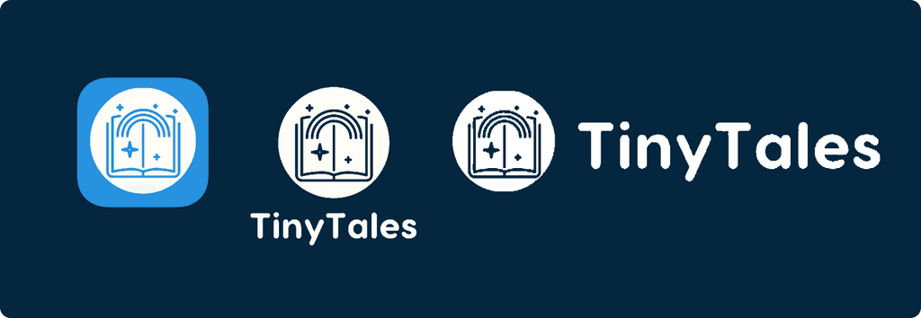
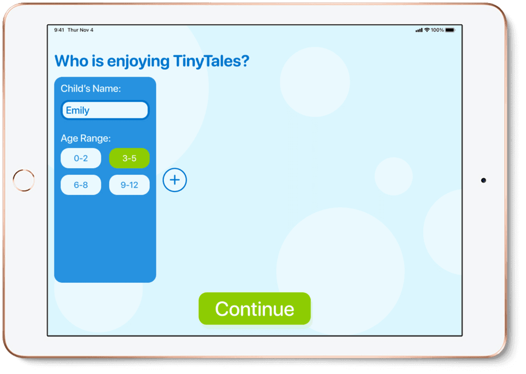
TinyTales had a logo, but there were no other branding assets given to me for this design sprint. I took this as an opportunity to propose my own style for my design solution. I tried multiple color schemes, and ultimately chose a bright blue for the primary color with green and red/orange as secondary colors.
Using the given logo to make an app icon with the new color scheme

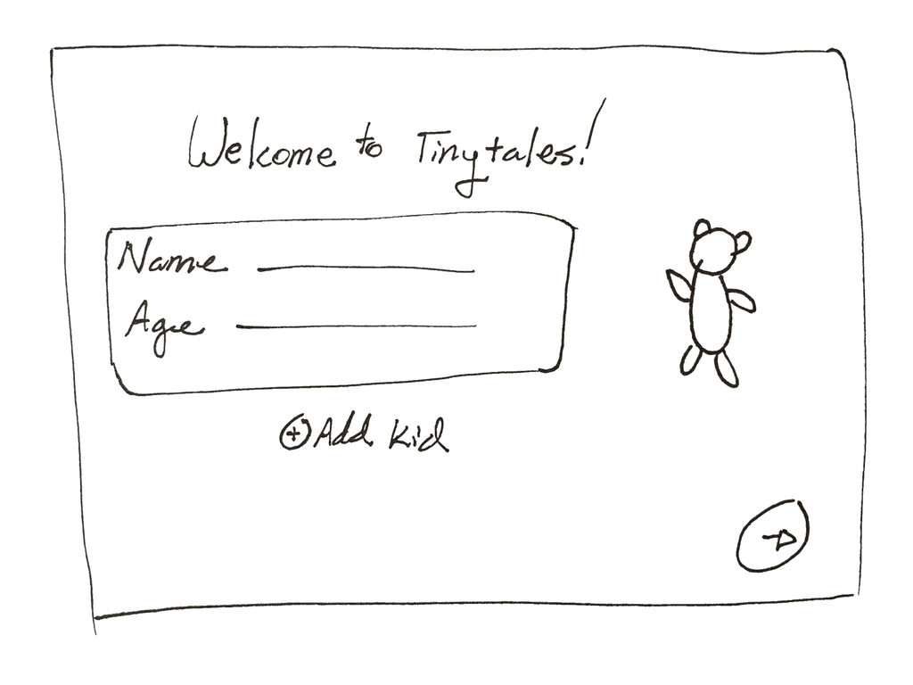
Expanding the Storyboard

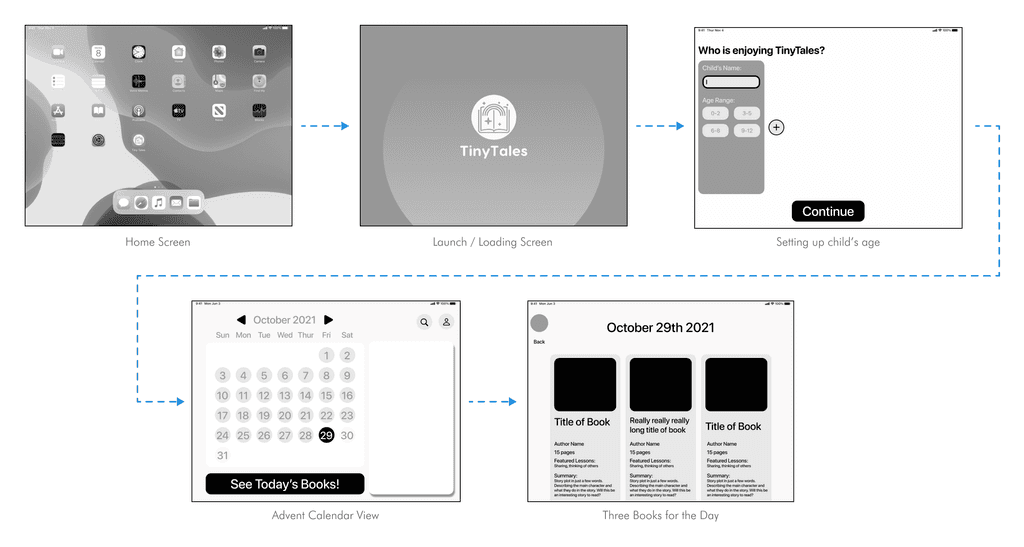
I expanded on the initial 3 screen storyboard from the previous day and worked through additional screens that would need to be used while choosing a story. This helped me to know each step that parents and children will tap through in order to start reading a story.

Day 4 - Prototyping

Building the Prototype

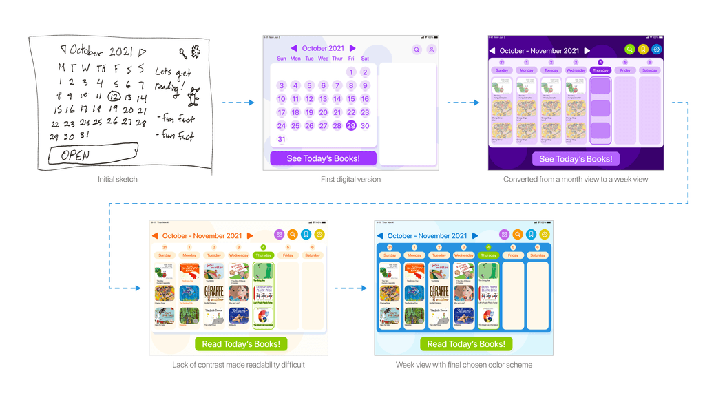
I worked to refine my designs. It took time to adjust the colors, fonts, and proportions of items so they were interesting and easy enough for kids and parents alike to navigate. I changed the color scheme multiple times and learned that there is a fine balance of being playful with color without being overwhelming. I worked to make the animation transitions smooth but fun and engaging for kids as they choose their stories.

Day 5 - Usability Testing

The Testing Setup

I had 5 people test out my design prototype. I was excited to see if my design actually helped people find stories to read.
I gathered test participants that were as close to my primary persona as possible. All of them had previous experience reading to children.
I performed three in person tests with an actual iPad that participants could hold. The other two participants were over individual Zoom calls and I had them navigate a Figma prototype on their laptops.

Learning How People React

Overall people enjoyed the design prototype! They liked the playfulness, advent calendar concept and color scheme.
One tester observed that this app may be overwhelming for kids aged 2-3 and underwhelming and boring for older kids past 7.

I realized that the audience for the app should be narrowed down even more, or be more clear about if it’s for parents or children to specifically navigate.
When it came down to choosing a story all the participants chose stories they were familiar with without reading the summary.

It was also noted that kids go through phases, like they really like trucks for a few months, and then move on. Perhaps I could add a feature for a “go-to stories” area that lists a kid’s favorite stories that they always want to go back to.
Many of the participants appreciated the featured lessons tags for each story so they knew what kind of educational values would be discussed.

Project Reflection

This sprint helped me produce designs more rapidly. Getting things down on paper and prototypes in front of participants quicker helped determine if ideas were worth pursuing or not. I think this is so valuable. The phrase ‘actions speak louder than words” rings true!

The formal Google Ventures sprint process is designed for a team of people to embark on over the course of 5 days. I did this sprint on my own, so there were parts that I modified. In the future I would love to try another sprint as a team!

Working on designing for kids was so refreshing. It challenged me to think about what is easy and appealing for young minds, and how that needs to be incorporated into my designs.

Other Projects

Amelia Burnett
User Experience Designer with a background in interior architecture
LinkedIn: /AmeliaLBurnett
© Amelia Burnett, 2024
Amelia Burnett
User Experience Designer with a background in interior architecture
LinkedIn: /AmeliaLBurnett
© Amelia Burnett, 2024
Amelia Burnett
User Experience Designer with a background in interior architecture
LinkedIn: /AmeliaLBurnett
© Amelia Burnett, 2024